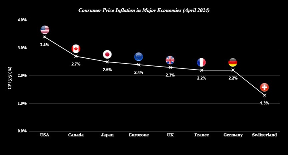
If you’re wondering why the dollar has been so resistant to declines this year, the graph above is a key reason. While price pressures in most major economies have eased further, the process has been much slower in the US i.e. inflation has been stickier. If you recall to August last year, we still saw UK CPI near 7%, Eurozone CPI just above 5%, and Canada CPI at 4%.
Of course, core prices are the more important element to focus on. So, let’s also try to take a look at that in comparison to the above.
- USA +3.6%
- Canada +2.9% (trimmed mean)
- Japan +2.4% (“core-core”)
- Eurozone +2.7%
- UK +3.9%
- France +1.9%
- Germany +3.0%
- Switzerland +1.2%
The rankings there are not too much different but it reaffirms that UK price pressures are still extremely stubborn. The lower April headline reading for the UK also owes much to Ofgem lowering the energy price cap by 12%. So, the core measure reflects that prices are still elevated.
But in the US, core prices are also still holding up and that is not enough to convince the Fed to cut rates for now.


.jpg)


